
Skip to content

KOLKATA, INDIA · REMOTE · UTC+5:30

ABOVE THE FOLD

DESIGNED IN FIGMA. SHIPPED IN NEXT.

LIVE WIRE

UX CASE STUDY · MEDECRO.AI · 2026

BEHANCE CASE STUDY

Medecro Clinic Dashboard: A UX Case Study in Adoption

How redesigning a single patient-facing card moved the AI X-ray Analyser feature from 20% to 43% adoption — and convinced a room of sceptical VCs with one slide.

Adoption lift

20% → 43%

Drop-off eliminated

78%

Sprint duration

3 weeks

Doctors interviewed

11

Medecro clinic dashboard redesign — showing the AI X-ray Analyser feature surfaced directly on the patient card, eliminating context-switching

02 — THE CONTEXT

The situation on the ground

THE CHALLENGE

78% of doctors never returned to the AI tab

Medecro's AI X-ray Analyser was clinically validated, CDSCO-compliant, and completely invisible to its users. Session recordings showed a painful loop: doctor opens patient card → realises X-rays need AI screening → navigates away to the X-ray tab → loses their place → gives up.

78%drop-off rate on
AI X-ray flow
  • Context switching mid-consultation
  • AI panel buried behind 2+ navigations
  • No visual cue when X-ray was already uploaded
  • Feature tutorial dismissed and never surfaced again

MY ROLE

UX/UI Design & Front-End Architecture

Embedded as the sole designer + design engineer for a 3-week sprint. My deliverables spanned the full design-to-code pipeline: user interviews, information architecture, Figma prototypes, and production-ready Next.js components using shadcn/ui.

Discovery11 doctor interviews, session replay analysis
UX StrategyJob-to-be-done mapping, flow diagrams
UI DesignFigma component library, design tokens
EngineeringNext.js 14, Tailwind CSS, shadcn/ui
HandoffStorybook-ready specs, Loom walkthroughs

03 — USER RESEARCH

Who actually uses this dashboard

Eleven contextual interviews across 4 clinic archetypes in tier-2 Indian cities. Moderated remotely via Zoom with screen share, supplemented with Hotjar session recordings. Four archetypal personas emerged.

11Interviews
4Clinic types
67Sessions reviewed
23Pain points mapped
Illustration of Dr. Navneet

Dr. Navneet

General Dentist

  • Switches to X-ray tab mid-consultation — loses patient context
  • Feels the AI feature is 'buried' — rarely surfaces it
  • Time pressure: 8 patients before lunch
"I know the AI can help me catch things faster, but I just don't have time to dig for it."

Illustration of Dr. Parag

Dr. Parag

Oral Surgeon

  • Wants historical X-ray comparisons in one place
  • Frustrated by re-uploading images already in the system
  • Needs AI screening on complex cases, not routine ones
"The feature exists. I just don't trust it enough yet to build a workflow around it."
Illustration of Rima

Rima

Front Desk Staff

  • Books appointments without knowing if AI screening is needed
  • No clear signal when a patient file has an X-ray ready
  • Dashboard feels information-dense — hard to scan quickly
"Half the time I don't even know the patient had an X-ray until the doctor asks me."
Illustration of Dr. Aisha

Dr. Aisha

Practice Manager

  • Can't see aggregate AI adoption metrics at a glance
  • No way to know which doctors are using screening vs not
  • Subscription costs hard to justify without usage data
"We paid for AI. I need to see our team actually using it before I report to the board."

04 — THE IMPACT

Before & after: what actually changed

The redesign didn't add features — it removed distance. The AI X-ray panel moved from a buried tab to a contextual card action.

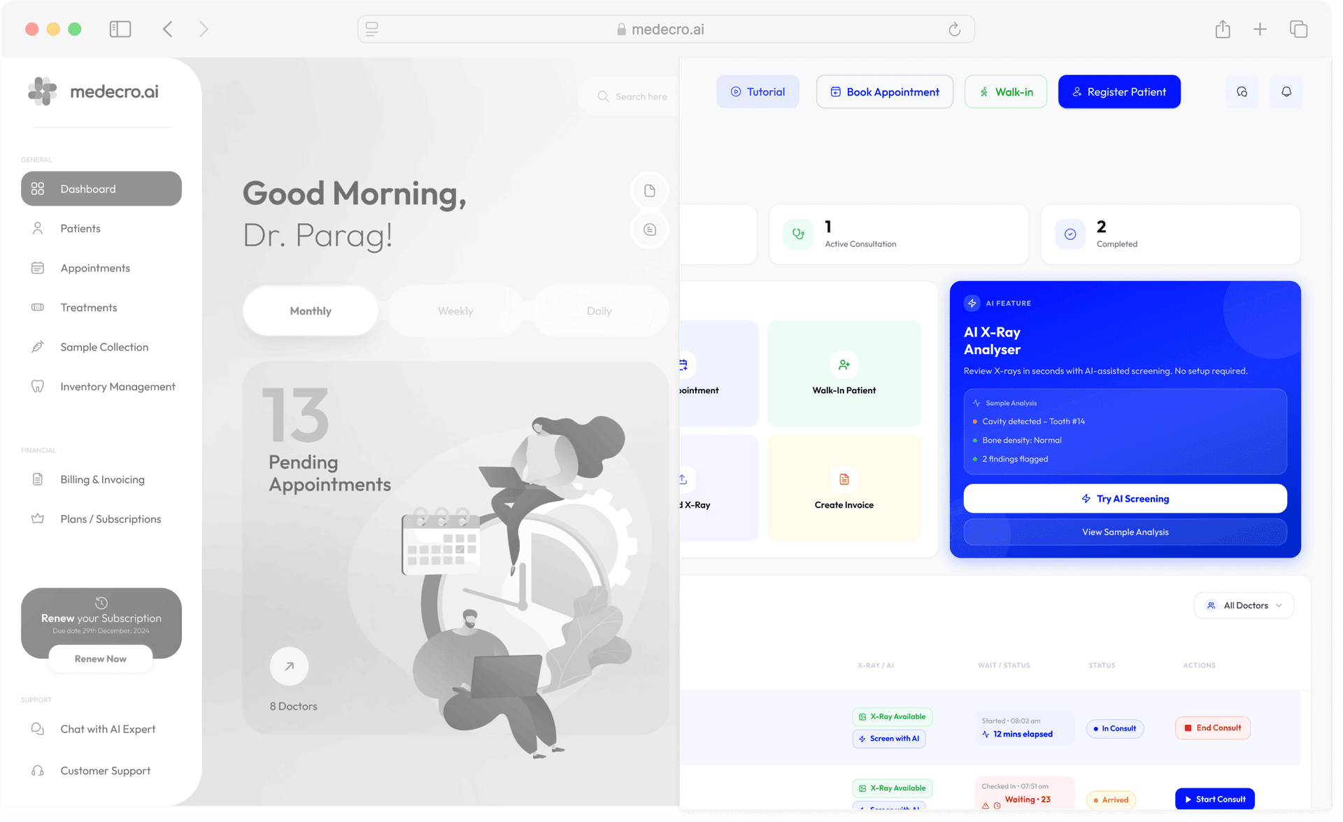
BEFORE — Original Dashboard

AI feature buried in a separate tab · 78% drop-off

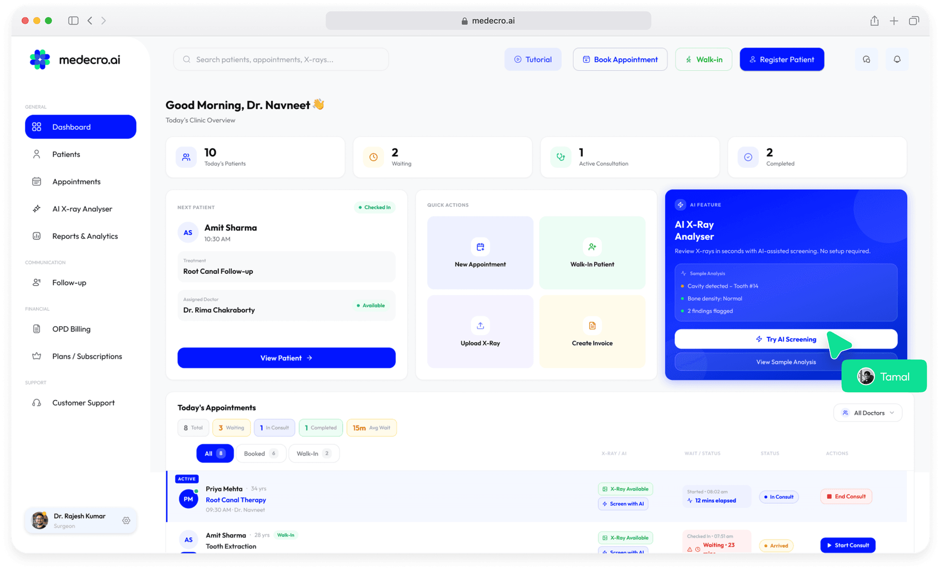
AFTER — Redesigned Dashboard

AI surfaced inline on the patient card · 43% adoption

Split-screen comparison: left shows the original Medecro dashboard with AI feature buried in a separate tab; right shows the redesigned version with the AI X-ray Analyser surfaced as an inline panel on the patient card

05 — RETROSPECTIVE

What I learned

Three weeks, eleven interviews, one pivotal metric. Five takeaways I'd carry into every healthcare UX engagement from here.

01 — THE HARD PART

Navigating Pushback

78% drop-off → design sprint approved

The founding team pushed back hard on a full redesign. The data changed the conversation. When I mapped the 78% drop-off against monthly active users, a single slide shifted the room.

VCs respond to metrics, not mockups. The 78% abandonment rate on the AI X-ray flow became the north-star argument that unlocked the design sprint — and taught me to lead every future brief with a business-case number before opening Figma.

78%context-switch drop-off turned into design mandate

02 — CORE METRIC

The Number That Mattered

Feature adoption of the AI X-ray Analyser — the metric that defined sprint success.

BEFORE

18%

AFTER

43%

03 — ROOT CAUSE

Chairside Reality

Dentists operate in a 7-minute consultation window. Any feature requiring a context switch — even a tab change — is effectively invisible. The fix wasn't better onboarding. It was bringing the feature to where the doctor already was.

KEY INSIGHT

“Proximity beats discoverability. Put the tool where the moment of need is.”

04 — DESIGN SYSTEM

Built on shadcn/ui

Every component shipped with a shadcn/ui primitive underneath — Sheet, Card, Badge, Tooltip. Zero custom component debt. The AI feature panel is a single Sheet component with a custom trigger surfaced on the patient card.

SheetCardBadgeTooltipDialog

05 — ENGINEERING

Lean Component Handoff

Every Figma frame maps 1:1 to a component in the Next.js codebase. The design file links directly to the Tailwind token. Developers shipped the new AI panel in two days — no spec translation needed.

2days to ship the redesigned AI panel to production